Bold primary colors can work in real homes without turning a room harsh or childish, but the livable version is usually more restrained than people expect. The practical rule is to keep strong primary tones to roughly 10% of the room, use them where they are easy to change, and match the color’s intensity to how the room is actually used day to day.
The main mistake is treating primary colors as all-or-nothing
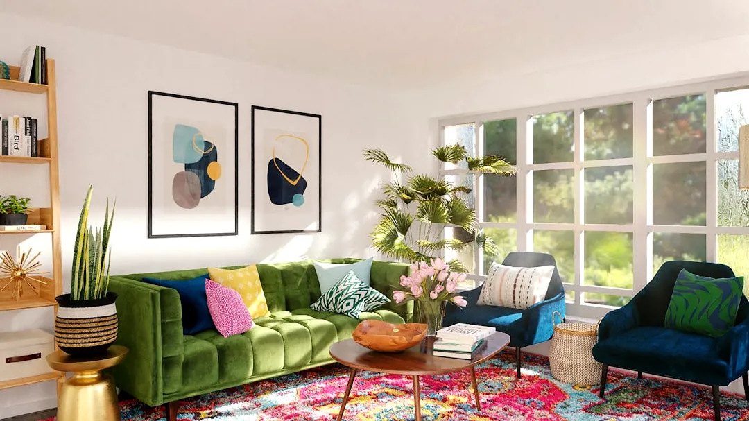
A common misread is that primary colors only count if they are bright, saturated red, yellow, and blue used at full strength. That is usually what makes a space feel tiring, theme-driven, or too close to a children’s room or holiday display. In everyday interiors, deeper or muted versions often do the better job because they keep the identity of the color while reducing glare and visual pressure.
This matters most in rooms where people stay for long stretches. A vivid primary on every major surface can feel exciting for a few minutes and exhausting after a week. Using toned-down reds and blues, or limiting a cleaner yellow to smaller areas, gives the room energy without making comfort harder to maintain.
How much primary color is enough to notice?
For most homes, about 10% of the room’s palette is a useful ceiling when you want impact without overload. That usually means the bold color shows up as accents rather than as the wall color on every side or the largest furniture piece in the room. It is enough to register immediately, but not so much that the room starts feeling visually busy.
That threshold also keeps costs and maintenance under control. Repainting a wall, replacing a sofa, or living with a large wrong-color cabinet is much harder than changing cushions, art, or a lamp. If you are unsure how much intensity your household can tolerate, staying near that 10% range is the safer starting point.
| Approach | What it looks like in practice | Best for | Main caution |
|---|---|---|---|
| Low-commitment accents | Artwork, cushions, lampshades, small decor | Renters, cautious decorators, seasonal updates | Can look scattered if colors are added without a clear limit |
| Medium commitment pieces | Accent chair, side table, pendant light, rug details | Rooms that need a stronger focal point | More noticeable if the shade feels too bright over time |
| Large-surface use | Painted wall, large sofa, cabinetry section | People already comfortable with strong color at home | Higher cost and harder to reverse if the room feels too intense |
Which primary colors feel best in different rooms?
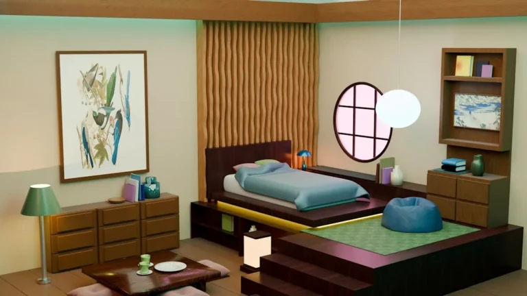
The room’s function should guide the color, not just personal preference. Yellow tends to energize, so it makes more sense in kitchens, breakfast areas, or creative corners than in spaces meant for winding down. Blue is generally the easiest primary to live with in bedrooms and bathrooms because it supports a calmer mood. Red adds warmth and social energy, which is why it often fits dining areas or other gathering spaces better than sleep spaces.
Pairing colors can also solve problems that a single bold shade creates on its own. Bright yellow can become more comfortable when it is balanced with calming blue, especially in rooms that need to feel cheerful but not restless. That combination keeps the room lively while reducing the sharpness that yellow can bring when it stands alone.
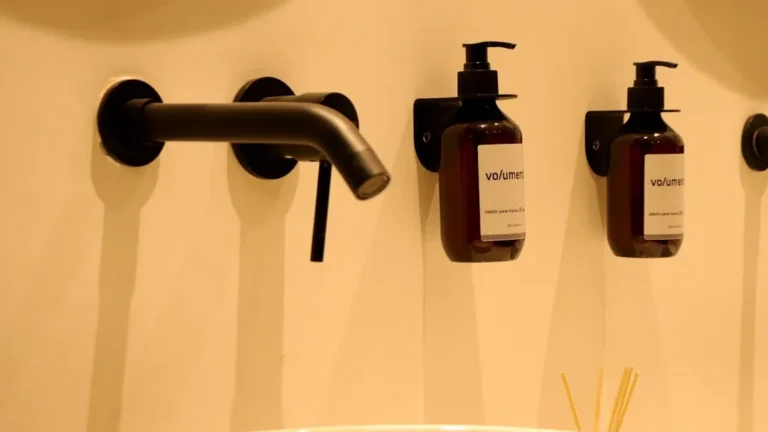
Smaller or secondary rooms are often the easiest places to be bolder. A powder room can handle a stronger wall color or vivid fixture because people use it briefly, while a bedroom usually benefits from richer, darker versions of primary tones rather than clear, high-energy ones.
Where to place bold color so the room stays flexible
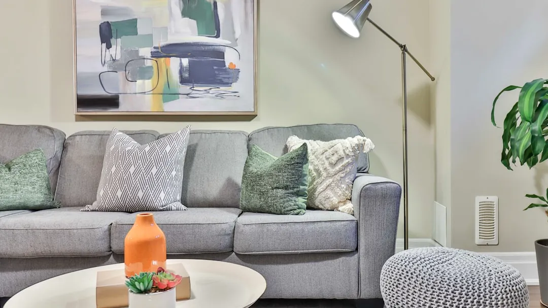
Accessories are usually the smartest entry point because they let you test color without locking in a costly decision. Artwork, cushions, throws, lamps, and smaller furniture pieces can carry red, yellow, or blue in a way that is visible but adjustable. If the room starts to feel too busy, those items are easy to remove, rotate, or redistribute.
This approach is especially practical for renters and for households that change layouts often. It also helps if you are still learning your own tolerance for visual intensity. A room that looks balanced in a photo can feel much stronger in daily use, especially under evening lighting or in a compact space with little visual break.
Natural textures and neutrals do useful work here. Wood, linen, stone, off-whites, and soft grays can ground primary accents so they read as intentional rather than loud. Without that grounding layer, even a small amount of bold color can feel more aggressive than the actual percentage suggests.
When to scale up, adjust, or stop
If a few accessories still feel comfortable after several weeks, that is a reasonable sign you can consider a larger move such as a chair, rug, or one painted surface. If the room already feels busy, if household members are sensitive to stimulation, or if the space is used for rest, it makes more sense to stay with muted shades and smaller placements.
There are also clear stop signals. If the color starts dominating every sightline, if the room feels less restful at night, or if you are compensating by removing useful items just to calm the space down, the intensity is probably too high. At that point, reducing saturation or shrinking the colored area usually works better than adding more neutral decor around it.
The next checkpoint is not whether you like primary colors in theory, but how much intensity your space and routine can actually handle. Once that is clear, it becomes easier to decide whether accents are enough or whether a larger surface will still feel livable six months later.